The following default breakpoints in Tailwind CSS are:
| name | width (px) |
|---|---|
tailwind: 00 xs |
639 |
tailwind: 01 sm min |
640 |
tailwind: 02 sm max |
767 |
tailwind: 03 md min |
768 |
tailwind: 04 md max |
1023 |
tailwind: 05 lg min |
1024 |
tailwind: 06 lg max |
1279 |
tailwind: 07 xl min |
1280 |
tailwind: 08 xl max |
1535 |
tailwind: 09 2xl min |
1536 |
Open the Google Chrome Developer Tools and click on the device toolbar menu (blue device icon)
![]()
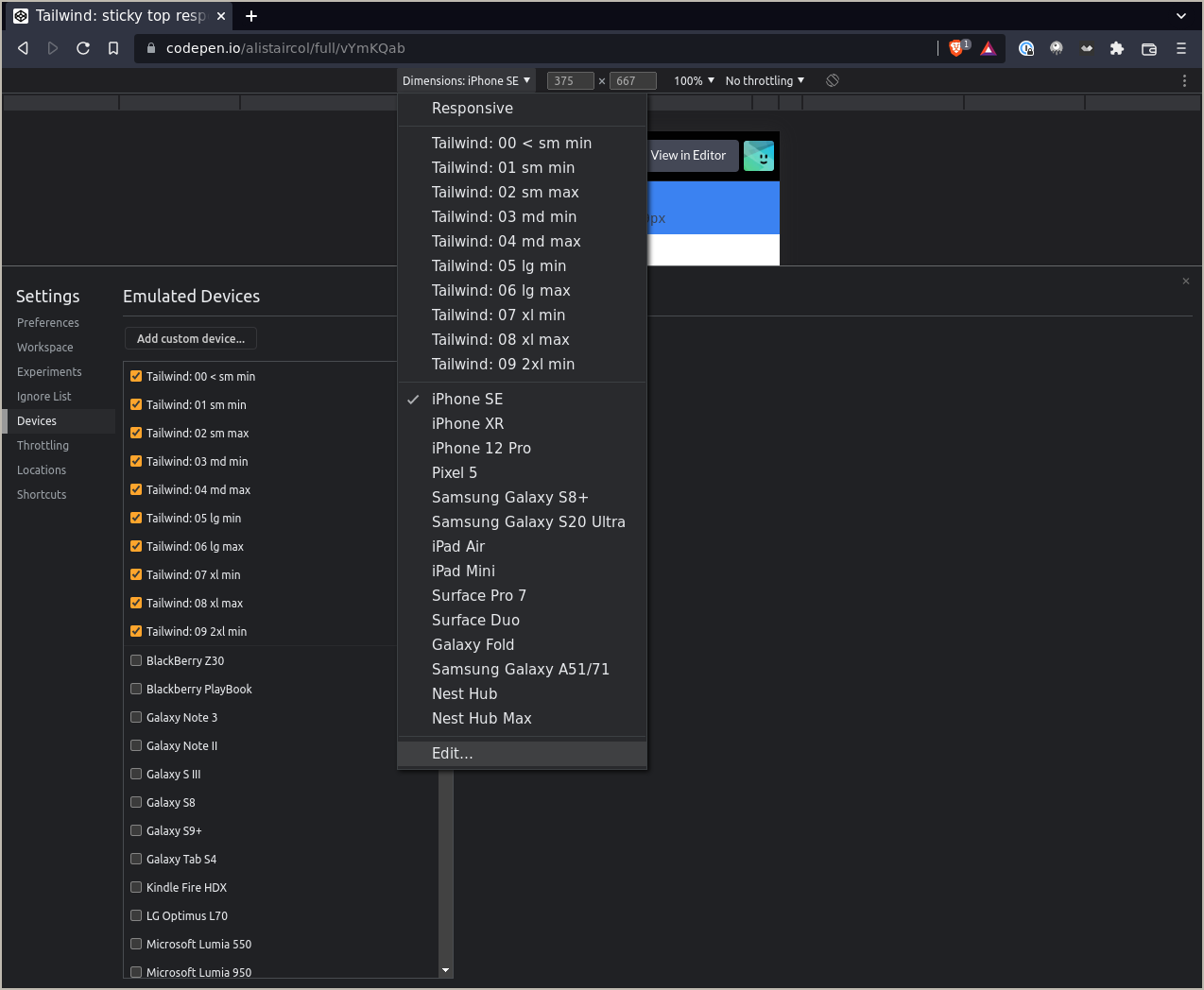
At the top of the web-page, below the URL bar click on the Dimensions menu and then click Edit at the bottom of the menu.
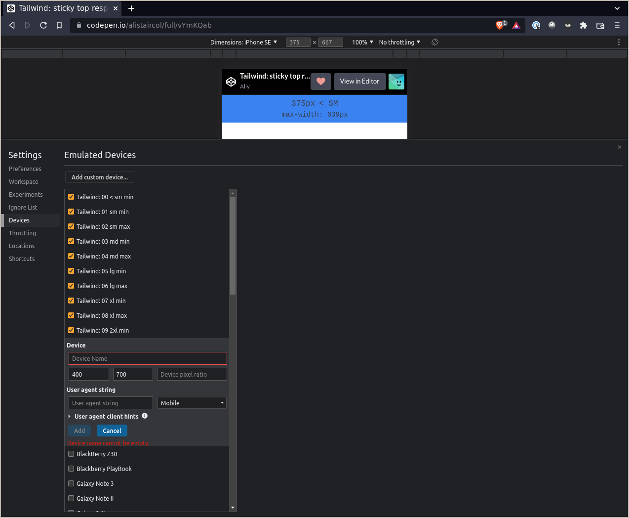
An Emulated Devices window will open developer tools window.

Add the devices with the following names and widths above, I recommend the device height to be around half of the height of your display.

I made the following codepen and use in the apps I work on to debug on different viewports.